Last Wednesday during the art meeting we proposed some possible interfaces for the menu in the tea house. These were my contributed mockups. The first one is the one we decided we would probably use, but Ill post all of the mockups I made.
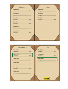
Mockup 1 (which we decided we would probably use)
This design uses the idea the the player will only have to hover over a # of menu items, select them, then select “order” once they are done. Selected Item will have some sort of effect encircling/highlighting them. The order button will only appear after the correct # of items are selected.
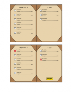
Mockup 2
Same idea as the first, only with check boxes next to the select item.
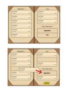
Mockup 3
Another similar idea, only having the player drag and drop their selected items into an area for each type of item they can choose on the menu.
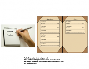
Mockup 4
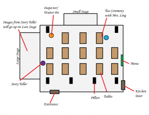
This is more of a lack of a visual interface. A menu will be be presented and the items will be ordered though speech to Waiter Pei standing to one of the side screen.
Mockup 5
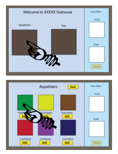
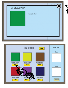
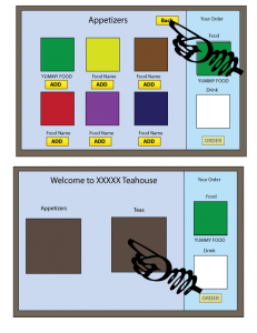
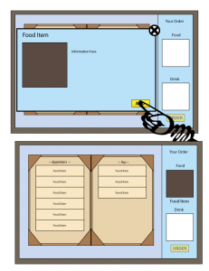
This interface would some an example of something more digital, something that could be possibly exported to an ipad or similar device. There is a “home” screen where all the categories of different food can be seen. Off to the side is an area that shows what the player must order. The player goes into each category to see the different samples of food they can order. To add it to their order, they select/touch “add”. A picture of the selected item will then be seen in the side screen. By selecting/touching the picture of the food, more information can be given. They can only order food once each section is filled.
Mockup 6
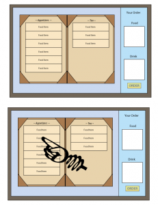
This interface takes the some concept as the previous one (5) and but uses an actual menu as its interface. The only difference is how food is added. All items are shown at once. By selecting a food item, a new window pops up telling more information about the item. You order an item though this menu.

