Modular construction kit
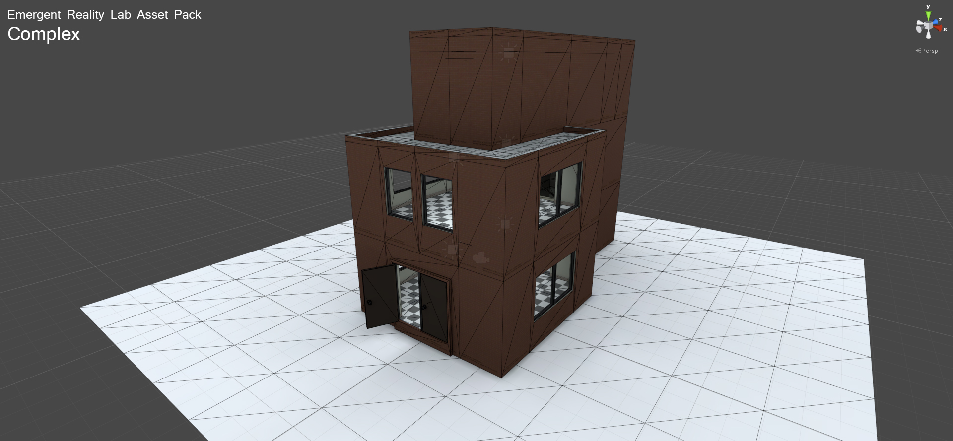
Anton Hand put together a modular asset kit for constructing environments for the ERL, which you can get here.
Comes with pieces for building interiors and exteriors as a Unity package along with tutorial videos.
Food Item List
1	Spring Rolls
2	Beef on a stick
3	steamed Dumplings
4	Fried wontons
6	Roast Pork (BBQ)
7	Stir fried bean curd
8	Rice noodle
9	Sesame chicken
10	Crab Rangoon
11	Beef and broccoli
Storyteller Interface Concepts
For the past week, I was tasked with creating and interface that would work with the Storyteller and possibly other characters. While the mockups I did are all for the storyteller, they can be changed to fit most interactions with other characters. Id also like to note that these mockups are based on four screenshots of the storyteller from another blog post, since that was all the available source material/information I had to work with. I used other concept art as filler for the story art.
Mockup 1
This interface is the most closely related to the source images. The main screen has the storyteller standing in front of the artwork for the story he is telling. On the left side of the right screen is his dialogue, allowing the player to look over if they miss something the storyteller said. It should only take up about a third or fourth of the right screen. On the right side of the left screen is a matching column where the players dialogue options will be displayed. These are the options the player must choose to navigate though the story. The selections are ‘point and click’.
Mockup 2
This mockup leaves all the interactions in the center screen, while the side screens show the art for the story. Its almost like the player is “imagining” the story they are being told. For other interactions, these screens can be left “blank”, or they can be used to show other important information. ie: for the tea ceremony, these side screens can show a pictograph of what is being talked about. Think like an IKEA catalog. The center panel has the character that is talking and any important props that they may have. In this case, we talked about having the storyteller on the stage with a slideshow to go along with his story. The slideshow in this case could be his written out dialogue. Below the actor, I incorporated the scroll interface that was talked about in a previous art meeting. In there will be where the player selects their dialogue options for navigating the story.
Mockup 3
This mockup is a combination of the previous two. The storyteller is on stage again with his slideshow, except this time he only shows objects or key concepts from the story. The player then “imagines” the scenes of the story in one of the side screens, while the opposite one will contain the dialogue of the storyteller. The players choices will be the scroll or a similar interface.
Mockup 4
This last mockup is just to show how we may be able to use an ipad to contain the players choices. Im not sure if this will be a feasible option, but I know it was discussed at lest a few times. The ipad interface can be used in place of any other previous ones, while keeping the rest of the designs the same.
Proposed Menu Interfaces
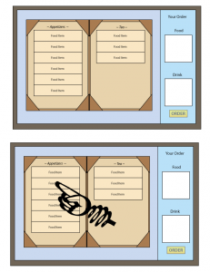
Last Wednesday during the art meeting we proposed some possible interfaces for the menu in the tea house. These were my contributed mockups. The first one is the one we decided we would probably use, but Ill post all of the mockups I made.
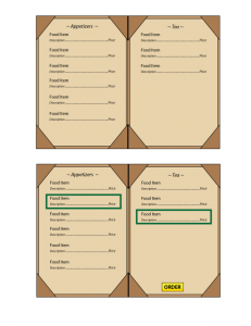
Mockup 1 (which we decided we would probably use)
This design uses the idea the the player will only have to hover over a # of menu items, select them, then select “order” once they are done. Selected Item will have some sort of effect encircling/highlighting them. The order button will only appear after the correct # of items are selected.
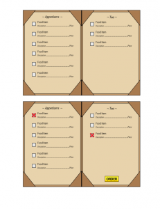
Mockup 2
Same idea as the first, only with check boxes next to the select item.
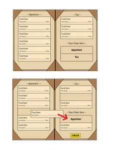
Mockup 3
Another similar idea, only having the player drag and drop their selected items into an area for each type of item they can choose on the menu.
Mockup 4
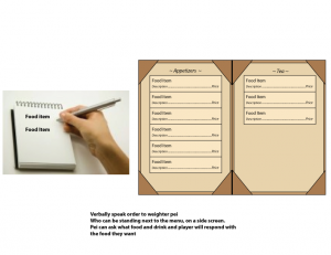
This is more of a lack of a visual interface. A menu will be be presented and the items will be ordered though speech to Waiter Pei standing to one of the side screen.
Mockup 5
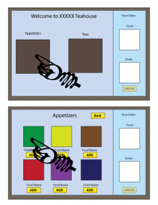
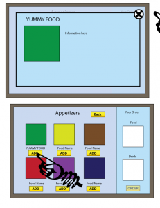
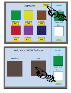
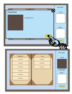
This interface would some an example of something more digital, something that could be possibly exported to an ipad or similar device. There is a “home” screen where all the categories of different food can be seen. Off to the side is an area that shows what the player must order. The player goes into each category to see the different samples of food they can order. To add it to their order, they select/touch “add”. A picture of the selected item will then be seen in the side screen. By selecting/touching the picture of the food, more information can be given. They can only order food once each section is filled.
Mockup 6
This interface takes the some concept as the previous one (5) and but uses an actual menu as its interface. The only difference is how food is added. All items are shown at once. By selecting a food item, a new window pops up telling more information about the item. You order an item though this menu.
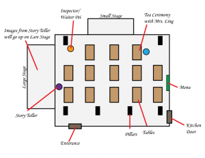
Teahouse Layout Proposal from Art Meeting
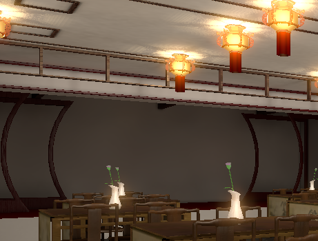
Teahouse environment version 2, Unity webplayer build
Updated version of the teahouse environment, preview in the Unity web player. Click the link below:
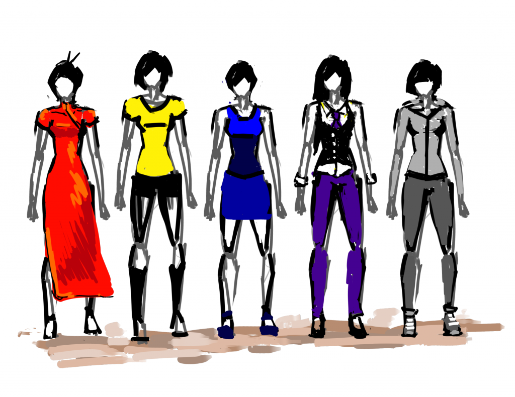
Clothing Concept (Female)
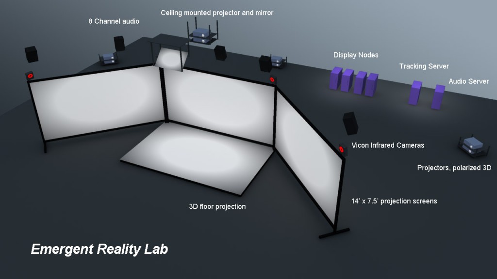
ERL layout
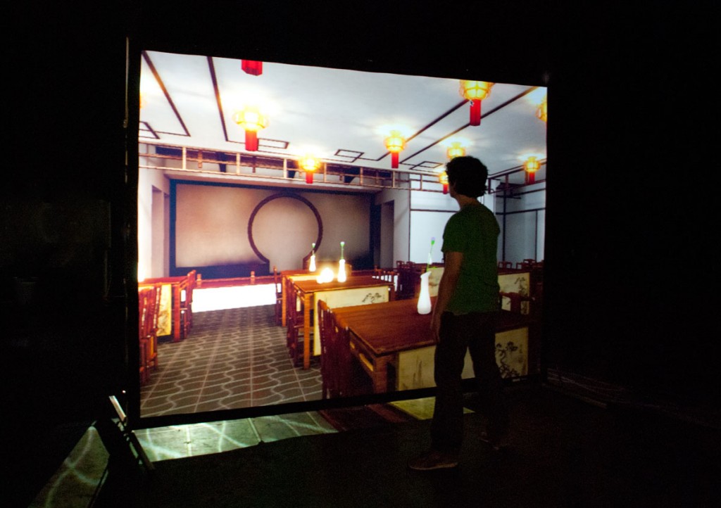
ERL photos
Images of Anton Hand’s new teahouse environment for Lost Manuscript II and Michael Gerber-Barron’s virtual storyteller on the testing screen at the ERL (10’x7.5′ Da-Lite Virtual Black fabric, Panasonic PT-AR100U projector). The screens for the full environment should be arriving soon, along with the computers, projectors, audio system and tracking system.

